Trying to view your project portfolio, to gain insight and make informed decisions is difficult and sometimes very confusing.
Especially if you are trying to do it using multiple, uncontrolled and un-validated spreadsheets that need to be manually updated. This is further complicated when you need to extract this spreadsheet data and convert into a format that can be viewed, shared and acted on.
No matter what business you are in, you will probably have a series of projects in your business. Some will be internal while others might be for customers and clients. In most cases they will typically have cost, time, risk, etc associated with them and fundamentally, will have an impact your business good or bad depending how well they are being delivered.
So how do you view your current project portfolio to ensure they are being delivered successfully?
Management by Meetings, Emails and Countless Reports
When I ask people how do they management their portfolios it is usually “With great difficulty”.
Even if you are an experienced organisation with good project management capability, processes and systems, its still a complicated, difficult and a time consuming process.
More often or not businesses create, manage and view their project portfolio through a series of functional meetings followed by a project board which reports to the main board or something similar. It also contains an inordinate amount of emails, conversations, spreadsheets and presentations that are created, edited and passed onto the next person up the line to extract, load and transpose into their report and so it goes on, until you get the “final document”. By which time it’s diluted and out of date because of the multiple iterations and is using data and information that was created some days, even weeks ago.
Furthermore, what do you do when you get the final document? I have seen some weekly reports 89 pages long for just one project! How are you supposed to digest, understand this information, make informed decisions and take action?
And to cap it all, the same process is repeated again every week or every month – wash rinse and repeat!
Sounds familiar? If it doesn’t and you have cracked it, I would really love to meet and talk with you.
Making this easier to do and providing you with current, accurate information in a more visual and collaborative way to help you uncover insights and make better decisions is key to delivering your projects and business more successfully.
Visualising your Project Portfolio
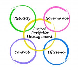
To get visibility of your Project Portfolio you need to have the governance, control and efficiency to get the visibility. All are interconnected. If you are missing your PPM will not operate to its full potential
So how do you do it? Well it’s not a quick fix, silver bullet that’s for sure.
To overcome the issues discussed above you certainly need to have the right tools, good quality data, processes that are aligned and completed by people and systems at the right time, correctly and consistently.
However, having the right mind set and behaviours is crucial, especially with regards to Governance and Control. You can have the best tools, systems and processes but if people do not have the right behaviours and mindset it will fail. This also requires that the organisation has the leadership, alignment and team work in place to support people.
With regards to tools there are many to choose from and all will do the job to varying degrees. An important aspect to consider is the updating projects, programmes and portfolios in real time, so you and your team are making decisions based in current information.
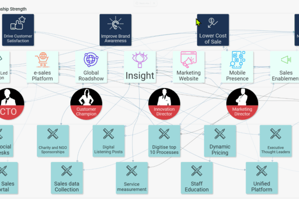
Here is one part of R-PPM to show you what I mean with regards to project data being rolled up from project updates to your portfolio. Click this link to see how R-PPM works.
Creating a visual collaboration culture
Making sure you have the right behaviours and mindset involves organisational leadership, a culture of continuous improvement and alignment with people who have the skills and experience, using processes that enable them to wok in an agile and collaborative manner, supported by appropriate tools, systems and quality, accurate data.
Getting started on your visual collaboration journey involves gaining an awareness and understanding as to where you are currently. This is done by completing and initial visual collaboration gap analysis.
Visual Collaboration Gap Analysis
The initial visual collaboration gap analysis provides a score out of 10. You need to be above 8 to ensure you are getting the most out of your data and collaborations. Once completed you can move onto the next stage where a more detailed gap analysis is completed with you to see where the gaps and opportunities are. This will also create your visual collaboration roadmap.
Combining both collaborative working and data visualisation using a visual collaboration solution such as R-PPM, powered by SharpCloud is something you might be interested in. If you are just leave your email in the box below and click the button and I will contact you to set up a call where we can discuss further how you can view your project portfolio and continuously improve your project outcomes.
Plus you will also get a complimentary 10 step Visual Collaboration guide to help improve your business collaboration and data visualisation.